deviant art

Deviant Login Shop  Join deviantART for FREE Take the Tour
[x]
Shop Similar Prints
This Print Not Available
Download Image
JPG, 751×1000
more ▶

More from *MarkTarrisse

Featured in Groups:

Details

August 25, 2010
432 KB
751×1000
Link
Thumb

Statistics

Comments: 13
Favourites: 28 [who?]

Views: 1,553 (0 today)
Downloads: 31 (0 today)
[x]
:iconmarktarrisse:
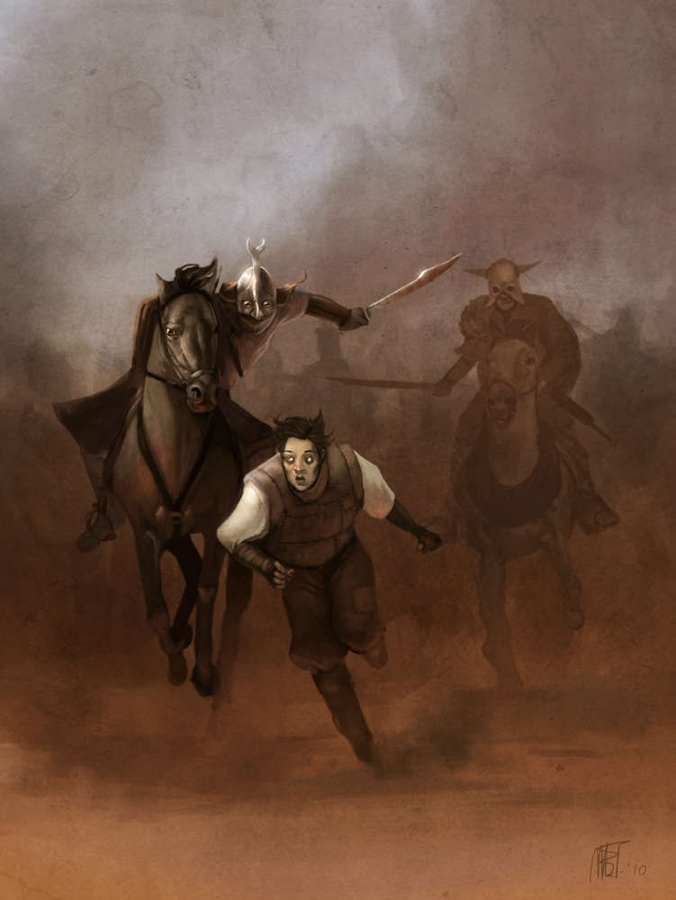
So here's an illustration I had started a long time ago, I decided to finish yesterday. So here it is, I must admit I'm not happy with the face I did for the runing guy, but I'm fedup of it.
Hope you'll like...
p.s: ref was used for the horses.
Add a Comment:
 
love 1 1 joy 0 0 wow 0 0 mad 0 0 sad 0 0 fear 0 0 neutral 0 0
:iconcey-cey:
güzel olmuş ...
Reply
:iconmarktarrisse:
*MarkTarrisse Aug 26, 2010  Professional Digital Artist
Teşekkürler :)
Reply
:iconlakehurwitz:
~LakeHurwitz Aug 25, 2010  Professional Digital Artist
YOU have been viewing cryptcrawler. I think. I'd advise caution with regards to the way that he handles speculars; they can be overexaggerated. Also, don't be afraid to really refine the hands and feet. Hands are very expressive and should receive nearly as much attention as faces. Feet are what ground the viewer in the picture. One well rendered foot in this would give us a ground plane and put us that much further in the scene.
Reply
:iconmarktarrisse:
*MarkTarrisse Aug 25, 2010  Professional Digital Artist
Hey thanks man, well actually I haven't been viewing cryptcrawler (I know him, but I personnaly don't like too much the way he's working :))
I agree for the hands and feet, but to be honest I was fed up of working on this illustration :)
But thanks a lot for taking the time to do some critics ! I appreciate it a lot, especially coming from you :)
Reply
:iconlakehurwitz:
~LakeHurwitz Aug 25, 2010  Professional Digital Artist
No problem.

The only reason I invoked cryptcrawler was because of your handling on the helmet and sword speculars. What tends to happen is the highlights all take on the same neutral hue and value. One thing that Dobsky always told us was to tier our highlights; figure out which one should be brightest and most saturated and step down from there.

Also, thanks for the crits on Vance, they're totally valid. I did him from the wee hours of 11:30 pm to 7 am the day before it was due, heh. I figured I'd just respond here to save paper :)
Reply
:iconmarktarrisse:
*MarkTarrisse Aug 25, 2010  Professional Digital Artist
Yea man you're right I understand what you're saying.
But as I am nearly entirely self though (except a year in an art school in belgium), I have many things that I have to learn, and comments like yours helps me to go further :) Thanks a lot !
Reply
:iconmidknight23:
~midknight23 Aug 25, 2010   General Artist
very cool
Reply
:iconmarktarrisse:
*MarkTarrisse Aug 25, 2010  Professional Digital Artist
Thnkss
Reply
:iconthesorceress:
nice stuff like always, I love the dust, makes me want to cough just by looking at it. The horse at the back, the leg position is hard to make out but it's probably just all that sand in my eyes :3
Reply
:iconmarktarrisse:
*MarkTarrisse Aug 25, 2010  Professional Digital Artist
Thank you :)
Reply
Add a Comment: